How can a strong and recognizable visual identity be developed and implemented across SKIN’s social media platforms, website, and product packaging?
The SKIN project was my final exam for the Multimedia Design degree at Copenhagen Business Academy. It centered on developing a unique visual identity that reflected the project’s core values. Through minimalist design and carefully chosen color palettes, I crafted a strong visual narrative that balanced aesthetics and functionality.
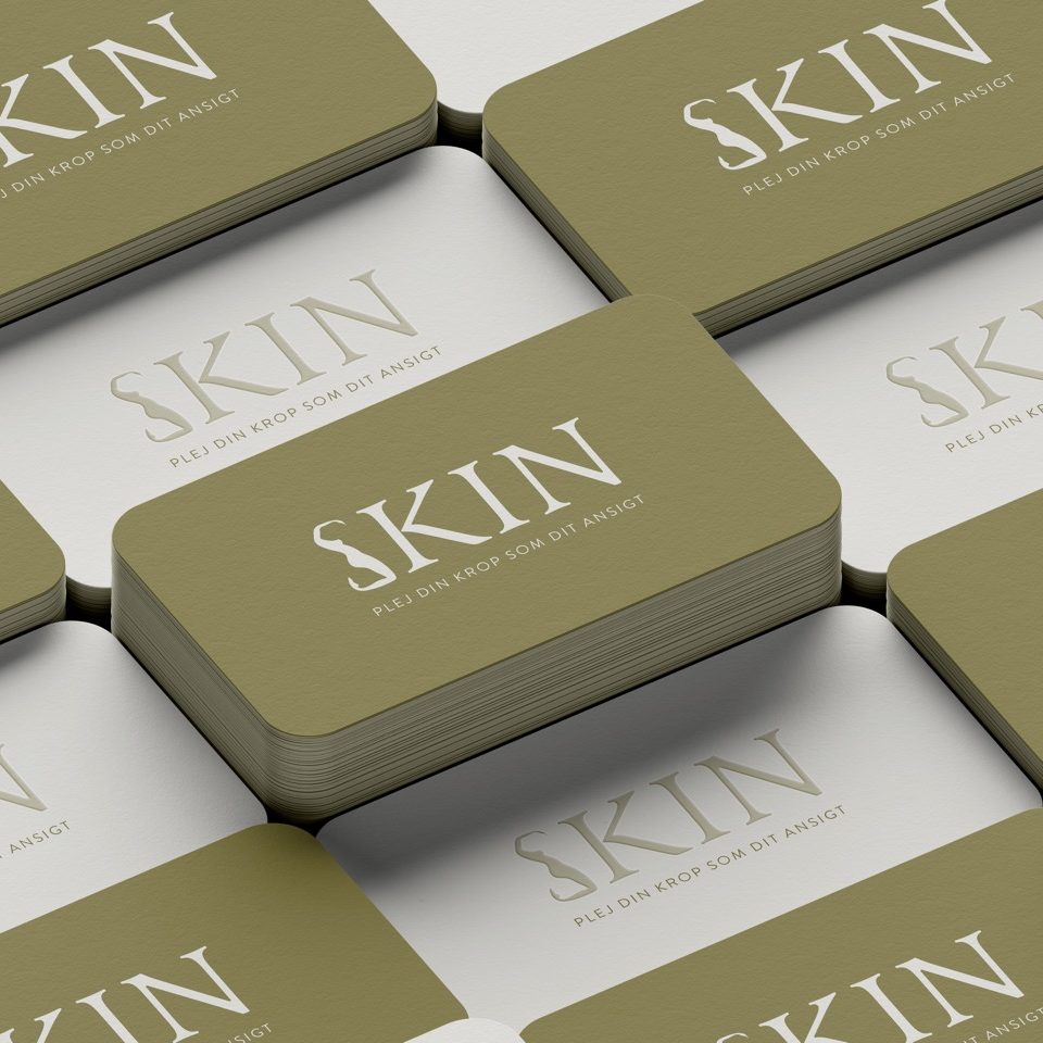
The concept behind the logo was to play with the female body and combine it with the letter ‘S’ in SKIN. The head was purposely excluded to emphasize the brand’s focus on body care primarily for women. The ‘S’ intertwined with the female body represents the shape of a woman, serving as both a logo mark and a symbol of the brand’s identity. This formed the foundation for the final primary logo, which includes the rest of the letters in the word SKIN. The typeface used was Latienne Pro Regular, with rounded serifs to visually complement the depiction of the female body as an ‘S’.
The color palette for SKIN combines olive green, derived from yellow, to reflect a blend of science and nature. This choice evokes a laboratory-like environment, aligning with SKIN’s focus on active ingredients. The monochromatic palette enhances brand recognition and works well with diverse content, ensuring a calm and elegant visual identity. Warm green tones make the brand feel less clinical and more inviting, while also symbolizing growth and renewal.
Since the skincare products were still under development, I created a packaging proposal. Using Adobe Dimension, I designed 3D models of the products, with labels designed in Illustrator and transferred to Dimension. The packaging design reflects the three Personas identified during the early research phase and focuses on simplicity, ensuring the logo and product names stand out. These names, developed through brainstorming sessions with the company, are eye-catching. To make the 3D models suitable for use in digital platforms, I recreated product formulas for realistic representation.
Lastly, I developed a user-friendly style guide, allowing the company to implement it independently. Several pages of the style guide are showcased in the project.